只是简单记录了下 css 实现的弧形
.convex {
    width: 100%;
    height: 300px;
    position: relative;
    overflow: hidden;
}

.convex::after {
    content: '';
    width: 100%;
    height: 300px;
    position: absolute;
    border-radius: 0 0 80% 80%;
    background: linear-gradient(to right, #f1b714, #f6fae0);
}

.concave {
    width: 100%;
    height: 300px;
    position: relative;
    overflow: hidden;
    background: linear-gradient(to right, #f1b714, #f6fae0);
}

.concave::after {
    content: '';
    position: absolute;
    width: 100%;
    height: 150px;
    bottom: 0;
    border-radius: 60% 60% 0 0;
    background: #fff;
}
<div class="convex"></div>
<div class="concave"></div>
效果如图:
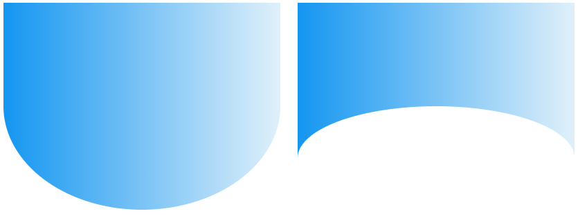
凹 和 凸 的实现并不一样,凹是用 :after 伪元素根据背景色遮盖的实现。临时想出的方法,并不一定合适。